virtualDavis

ˈvər-chə-wəlˈdā-vəs Serial storyteller, poetry pusher, digital doodler, flâneur.

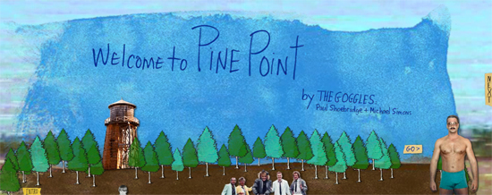
Goggling Welcome to Pine Point

"Welcome to Pine Point", innovative digital storytelling by The Goggles

Welcome to Pine Point, innovative digital storytelling by The Goggles

Much of the innovation driving digital storytelling is still half-baked. Most storytellers are just beginning to fathom the riches of this new frontier, and for many of us it means learning (and inventing) new storytelling techniques to effectively leverage the cross-platform capabilities of digital storytelling.

And yet inspiration is every day more abundant. Recently I discovered a digital story so innovative and compelling that I looped it as soon as it ended. Even though the subject interested me very little (at least at first), I dove in again and again devouring the recipe and savoring the experience.

Welcome to Pine Point by Paul Shoebridge and Michael Simons (aka The Goggles) is an interactive, short format documentary about an erased industry town in Canada’s Northwest Territories. It’s incredibly clever, all the more so because it conjures a compelling, captivating narrative experience out of rather grotty 1970s and 1980s miscellanea.

I’ll pass the baton off to Dan Blank (@DanBlank) who already reviewed “Welcome to Pine Point” nimbly on his business blog, We Grow Media back in March 2011. (Yes, I’m late to the Pine Point party!)

The documentary tells the story of this town – through photos, interviews, videos. How it came to be, what it was like to live there, and how it came to its demise. Literally, the town was torn down, and left as a barren wasteland with no signs of its previous existence except for some crumbling pavement. Wiped from the planet.

This film came about when it was discovered that a former town resident, Richard Cloutier, had created a website where he was cataloging the world that was Pine Point. He was collecting and sharing photos, stories and other updates. It is called Pine Point Revisited. (We Grow Media)

Welcome to Pine Point is an illuminating example of digital storytelling’s potential. I take notes each time I wander through its nostalgic messiness. A truly enticing messiness, I should add.

It’s part film, part photo album, and completely fascinating. (Deirdre Foley-Mendelssohn)

They’ve made an homage to memory, at once linear and exploratory, unraveling through a poetic collage of writing, image, video, sound, voice and music, all in service of a story. (transom.org)

Despite the rough, hand-animated photo-collages and humble lettering, Welcome to Pine Point achieves sophisticated and haunting effects as it chronicles a small Canadian town that was literally wiped off the map… (Scott McCloud)

Mike Dormuth and Richard Cloutier

Mike Dormuth and Richard Cloutier

But no matter how much Webby-winning awesomeness is packed into Welcome to Pine Point, it would not (and could not) exist but for Richard Cloutier’s Pine Point Revisited. While Cloutier’s Pine Point memorial/tribute is basic — its vintage turn-of-the-century navigation and style emphasize content, not aesthetics — it is a deep, dusty archive. It’s a museum. Or a warehouse. It’s a digital reunion for neighbors, friends and colleagues torn apart by time and chance. It’s a surrogate or a facsimile for a place that no longer exists.

But Pine Point Revisited also offers the inspiration, the skeleton and much of the source material for Welcome to Pine Point. In a sense, the documentary is a remix of Cloutier’s website permitting him to play one of the starring leads, though you don’t fully appreciate this until the end of the video.

While accolades aplenty have rightfully rained upon Shoebridge and Simons for their groundbreaking digital storytelling, Cloutier’s digital storytelling is the underlying source and inspiration for The Goggles’ mashup. While recognizing and celebrating this does not diminish Shoebridge’s and Simons’ accomplishments, it does award Cloutier for his less flashy, but hard earned accomplishment. I tip my hat to all three!

Creative Theft: I Stole Dali’s Dove

Creative Theft: I Stole Dali's Dove, by Terre Britton

Creative Theft: I Stole Dali’s Dove, by Terre Britton

“Art is theft.” ~ Pablo Picasso

The day after Thanksgiving Florida-based artist and designer Terre Britton (@TerreBritton) stole Dali’s dove. While her act was brazen and her confession unremorseful, I suspect that Austin Kleon — author of Steal Like an Artist and Newspaper Blackout — would congratulate her creative theft and probably even encourage her to steal more!

“What a good artist understands is that nothing comes from nowhere. All creative work builds on what came before. Nothing is completely original.” ~ Austin Kleon (Steal Like an Artist)

Here’s Britton’s confession, published on her blog, TerreBritton.com:

I Stole Dali’s Dove is based on… [a] sketch I produced… nearly 30 years ago. I had planned to leave the right side of the canvas blank… But then, I happened upon The Ecumenical Council (1960), by Salvador Dali, at the Dali Museum in St. Petersburg, FL, and I was wooed by his dove. It’s in the top right of his magnificent canvas. Being that I was grappling with the concept of thievery, I wondered what it would be like to steal someone’s art… so I did! … I feel quite satisfied and, at times, justified at having that lovely little dove accompanying, inspiring, and protecting me. ~ Terre Britton

Britton, co-author of Energetics: The First Order and owner of Terrabyte Graphics, is no stranger to the increasingly strained relationship between creativity and copyright. Nor is she simply cribbing and cobbling for the sake of hitchhiking on the efforts of other artists. As the curator for Creative Flux Britton explores the creative process (which necessarily encompasses creative theft) through her own eyes as a writer and painter as well as the experiences of other creators. Here are a few recent excerpts.

I’m not officially Licensed to Write . . . but I do have a child’s irrepressible imagination.  ~ Ruth Long (Confessions of a Rogue Ink Slinger)

We must dive forward into the agony—sitting there with our face lying sideways on the desk—and discover within it every reason writing is an inanely bad idea… We will lie there and sob. Gnash our teeth… And when we are done, we will know something about life we didn’t know before. We will know how to survive… And then we’ll have something to write about. ~ Victoria Mixon (Going Beyond the Beyond)

I’m convinced that the creative process for fiction writers is a messy mixture of imagination, insecurity, and wee bit of insanity. Combine ingredients, shake well, then get the synapses to start firing, and wait for sheer genius to flow from every pore in your body. ~ Karl Sprague (Enjoy the Ride)

When you have the idea, you next have to figure out how to make it work in practice. It’s one thing to dream, but it’s completely another to engineer the final solution. ~ David Straker (Creativity’s The Easy Bit)

As if intentionally melding these four observations, Britton’s painting is simultaneously placid and wrenching, disturbing and beguiling. The color-play between the eyes and the shirt, the uncomfortable framing, and the bouquet of textures (hair, shirt, feathers) all contribute to the painting’s unnerving impact. Certainly Britton has not copied Dali’s Ecumenical Council!

Her creative theft is a visual footnote to Dali’s painting, not an imitation. Her painting is a mashup/remix of diverse elements — a black and white sketch she completed three decades ago, a nod to Dali’s dove, and unconventional cropping/coloring choices — which result in a totally original and highly creative image. Proof positive that creative theft provides valuable, if not essential, ingredients for artists. After all, as Kleon reminds us, “The artist is a collector”, selectively culling ingredients gathered along life’s adventure, and then weaving these ingredients into art. Bravo, Terre! Keep stealing! Creative theft serves you well.

Ed Rondthaler Flips for Spelling Reform

Ed Rondthaler (1905-2009) was a typographist and the co-founder (with Harold Horman) of Photo-Lettering, Inc. A man of letters. A man of words. And, it turns out, a man of spelling…

Ed Rondthaler was an advocate for “simplified spelling“.

This creative video intrigued me both for the obvious logic and appeal of a simplified spelling which Ed Rondthaler cultivates with his clever flip cards, and for the innovative storytelling technique.

Although suffering from a late Autumn cold, a the always gracious Ed Rondthaler spent a day with us and our film crew on rainy, cold November afternoon. Framed by the muted surroundings of his Croton-on-Hudson Sears and Roebuck kit log house that he purchased from a Naval Commander in 1938, Ed talked about his years running Photo-Lettering Inc. and the surrounding developments with remarkable precision and clarity. A lifetime proponent of spelling reform, Ed was gracious enough to state a compelling case with a well worn flip chart. Ed would live on another two years before finally giving way to the Twenty-First Century at the ripe young age of 104. We cannot begin to express our gratitude to Ed Rondthaler for his time and effort in helping us preserve the Photo-Lettering legacy, but we hope to perpetuate his passion for spelling reform by showing this short film. (Ed Rondthaler on English spelling)

English: Ed Rondthaler at his residence in Cro...

Ed Rondthaler (Photo: Wikipedia)

According to Ed Rondthaler’s 0bituary in the New York Times on August 29, 2009, he “Edward Rondthaler was one of the 20th century’s foremost men of letters — actual, physical, audible letters.” (NYTimes.com)

He advocated phonetic spelling in order to “vanquish orthographic hobgoblins, promote literacy and make accessible to foreign readers English classics…” (NYTimes.com)

Although his dream of a transition to English written as it sounds was not realized during his lifetime, his legacy was secured long before his quest for SoundSpel.

Mr. Rondthaler had already established a national reputation by helping usher in the age of photographic typesetting. Phototypesetting was for decades a vital bridge between the hot-metal days of old and the digital typography of today. (NYTimes.com)

The Huffington Post’s Alastair Plumb featured Rondthaler’s zany video last January with this perfect introduction.

Displaying astonishing verbal and mental dexterity, he explains via a miniature flip chart just why English as a language makes no sense at all. Sounds a bit boring, doesn’t it? Trust us, it isn’t. (Huffington Post)

Trust me. It isn’t!

Build a Better Blog Community: Find Your Why

Find Your Why: Step #1 for building a better blog community

“When genuine passion moves you, say what you’ve got to say, and say it hot.” ~ D. H. Lawrence

Justine Musk (@justinemusk) knows a thing or ten about cultivating a blog community and — as per her creative badass reputation — she dishes up the goods unprocessed, uncooked and ungarnished. I think of her blog a little bit like a macrobiotic diet for creative people.

Except less daunting. And more enticing.

I guess macrobiotic isn’t quite the metaphor I’m reaching for. Raw? Cold? No…

Justine Musk is passionate and she says it hot! D. H. Lawrence would be proud.

She’s curious. She’s brave. She’s unafraid. She’s a hungry learner. And a great teacher.

I follow her blog precisely because she practices what she preaches in her post, “how to start creating your blog community“. Find your why. Teach to learn.

Justine Musk: Find Your Why

you have to go beyond pretend and find the real… ask yourself why you do what you do in the first place: what compelled you to… write this novel, paint these paintings…

After all, it’s your Why that fuels you.

It’s also your Why that connects with people on an emotional level, stirs and inspires them, creates loyalty to your business, your art, your brand. You.

So find your Why.

[…]

Create a question around your Why that genuinely intrigues you. As you explore the different aspects of it, you put out content that (hopefully) entertains and enlightens your right readers, draws them in, invites them along on the journey with you. You teach to reach, but teaching goes both ways. The community learns from you, and you learn from the community.

The best way to learn something is to teach it. Or as a friend of mine likes to point out, “We teach what we most need to learn.” ~ Justine Musk

When I began teaching during my graduate school years, I felt like I was cheating the system. Getting paid to learn? Better not let anybody find out!

The best teachers are the best learners. Perpetual learners. Open minded learners. Generous learners. And a blog is in many ways the ideal 21st century classroom. A digital olive grove.

Find your why and hunt down answers as if your very being depends upon it. It does. And when you discover more questions than answers, don’t worry. You’re headed in the right direction.

As others flock to your digital olive grove, you just may find that a few of your students are your best teachers. And we’ll support and encourage you every step of the way. Try us!


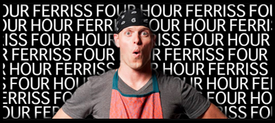
The 4-Hour Chef’s Not So Simple Path to Buzz

The 4-Hour Chef's Not So Simple Path to Buzz

The 4-Hour Chef’s Not So Simple Path to Buzz

Four Hour Ferriss has done it again!

Tim Ferriss (@tferriss), the author of The 4-Hour Workweek and The 4-Hour Body, may soon prove to be the sellingest banned author alive. His latest foray into the self transformation space is called The 4-Hour Chef, and Ferriss is quick to point out that it’s more than a how-to-cook book.

The 4-Hour Chef

Whether you want to learn how to speak a new language in three months, how to shoot a three-pointer in one weekend, or how to memorize a deck of cards in less than a minute, the true “recipe” of this book is exactly that: a process for acquiring any skill. The vehicle I chose is cooking. Yes, I’ll teach you all the most flexible techniques of culinary school using 14 strategically chosen meals, all with four or fewer ingredients, and all taking 5-20 minutes to prepare (literally, The 4-Hour Chef). But I wrote this book to make you a master student of all things. (fourhourchef.com)

A master student of all things! This, after all, is Ferriss‘ passion and strength. He loves to learn (and learn totally, efficiently and thoroughly), and his books are first and foremost toolkits for lifelong learners. Ferris who advises and teaches for the Singularity Universitywhich focuses on leveraging accelerating technologies to address global problems“, is always racing the clock. Even in interviews, he sounds like he’d rather accelerate the Q&A.

The 4-Hour Bestseller

While I expect to enjoy and reference The 4-Hour Chef as much as the first two, what I’m really waiting for is the book he should write next: The 4-Hour Bestseller. It seems inevitable given the transformative forces at work in the publishing world. Ferriss has opined often enough on the present and future of publishing, and he’s a guerrilla master of self-promotion and book sales/marketing. Could his definitive guide to successful publishing in the digital age be far behind The 4-Hour Chef?

I’m anticipating a detailed, step-by-step guide to the art and science of book publishing focusing on the following:

  1. researching, niche targeting, writing and revising your book
  2. leveraging social media, etc. to build book/author platform
  3. editing, representing, strategic fine-tuning your manuscript
  4. publishing your book in the brave new world of 21st century publishing
  5. sequencing a book launch with high-impact, symphonic precision
  6. promoting and selling the heck out of your book!

If he’s not already working on The 4-Hour Bestseller, I’d be surprised. And disappointed!

The 4-Hour Chef Update

121126: True to form, Four Hour Ferriss is chronicling The 4-Hour Chef book launch through his blog, offering up a transparent glimpse of his strategy to peddle the hell out of The 4-Hour Chef despite being banned by 700+ bookstores nationwide! It’s a savvy PR move, effectively enlisting us, his readers and fans, to help fuel his publicity campaign by keeping us in the loop. Think of a grassroots political campaign. Think of community organizing. Damned effective. But not remotely exploitative because Ferriss is simultaneously sharing his process with anyone and everyone interested in learning how to roll out a successful launch. In other words, he’s offering us section #5 of The 4-Hour Bestseller for free! Whether he ever actually creates the book or not, it’s an example of Ferris’ value-added approach to community building, networking and marketing. His post “Marketing/PR Summary of Week One” reveals the staggering impact of his roll-out, listing bookstores, offline/online media and partnerships that would inspire envy among the launch gurus at any traditional publisher. Kudos!

Related articles

Hannah Brencher on Letters, Strangers and Love

“I posed a kind of crazy promise to the Internet: that if you asked me for a hand-written letter, I would write you one, no questions asked.” ~ Hannah Brencher

Hannah Brencher‘s (@hannahbrencher) phrasing, and the idea it sums up, struck home. First, there’s that opening phrase.  The Internet for those who’ve grown up with it is an entity. A being. Like the universe. Or a god.

More Love LettersFor me — and I suspect for many others too who watched the Internet’s birth, that first spank on its still wet posterior, that first gasp of air followed by a global yowl — the Internet is a communication infrastructure, a virtual web connecting beings and entities. But I find Brechner’s notion immensely appealing. And accurate. The idea that I could make a promise to the Internet might have seemed trite in another time, another context. But Brencher’s story and her promise kept, More Love Letters, is proof positive that the Internet is infinitely more than the sum of its parts. The Internet is a being. A universe. A god.

And then there’s the tribute to handwritten correspondence.

Many of you who know me personally (and even some who don’t) have received a handwritten note from me at one time or another. Usually written with green ink and barely legible handwriting. For no reason other than that I love green ink, and — though my penmanship is poor — I wanted to share some words with you. Smudges and all. Don’t get me wrong, voice mail and email and text messages and social media updates and pokes and tweets all have their important roles to play, but increasingly rare handwritten notes are special. They are real and enduring and intimate in a way that digital notes are not.

Last but not least there’s that exciting gulp feeling you get when you watch Brencher’s TED Talk. Maybe even a joyful tear. And it’s not because she kept her promise or the Internet’s a god or you’re getting sepia-toned nostalgic about paper and ink. It’s a gulp because what she’s built is good. Really good. So good that it’s gone viral and created a global tribe of benevolent love letter planters.

I tip my proverbial hat (or fountain pen?) to friend and frequent inspiration, Athena Roth (Pinterest) who shared Hannah Brencher’s “Love letters to strangers” with me. Roth’s song and aesthetic sensibilities are gifts not altogether unlike Brencher’s love letters.

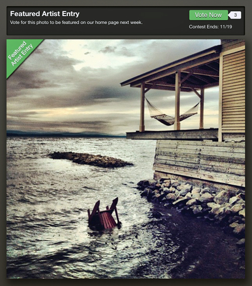
Photo of the Week?

Rosslyn Boathouse: photo of the week?

Rosslyn Boathouse: photo of the week?

This is your last chance to fuel my ego! Until next time…

This ominous photo of Rosslyn boathouse is in the running for Instacanv.as‘s Photo of the Week and your vote could be the tipping point.

The photo was a spontaneous iPhone-born Instagram post that I shared right after Hurricane Isaac passed through Essex, New York. (Remember Hurricane Isaac? It’s gotten difficult to keep them all separate, and to think that only a few years ago we figured hurricane troubles were about the last problem we needed to worry about in the Adirondacks.) If you’re interested in the rest of the back story for this image, check out “Photo of the Week: Hurricane Isaac”.

Voting ends today, so if you’re feeling generous, supportive or just a little wild, please consider voting and/or sharing this post with your friends. I’d love to see this photo featured. Thanks for your help. Vote HERE.

And, if you’re feeling inspired (and I hope that you are because a Monday without inspiration is deadly!) feel free to share your own personal Photo of the Day in the comments below. I’d love to see what cool pics you’re hiding on your mobile phone.

Robot Flâneur

How do flâneurs indulge their habit when confined to their studies, jockeying their bureaus?

We read. We write. We shuffle and curate photographs. But sometimes — jonesing uncontrollably for a brief flânerie fix — we dive into the digital arcades. The popularity of my recent post on cyberflânerie has prompted me to share a secret pleasure.

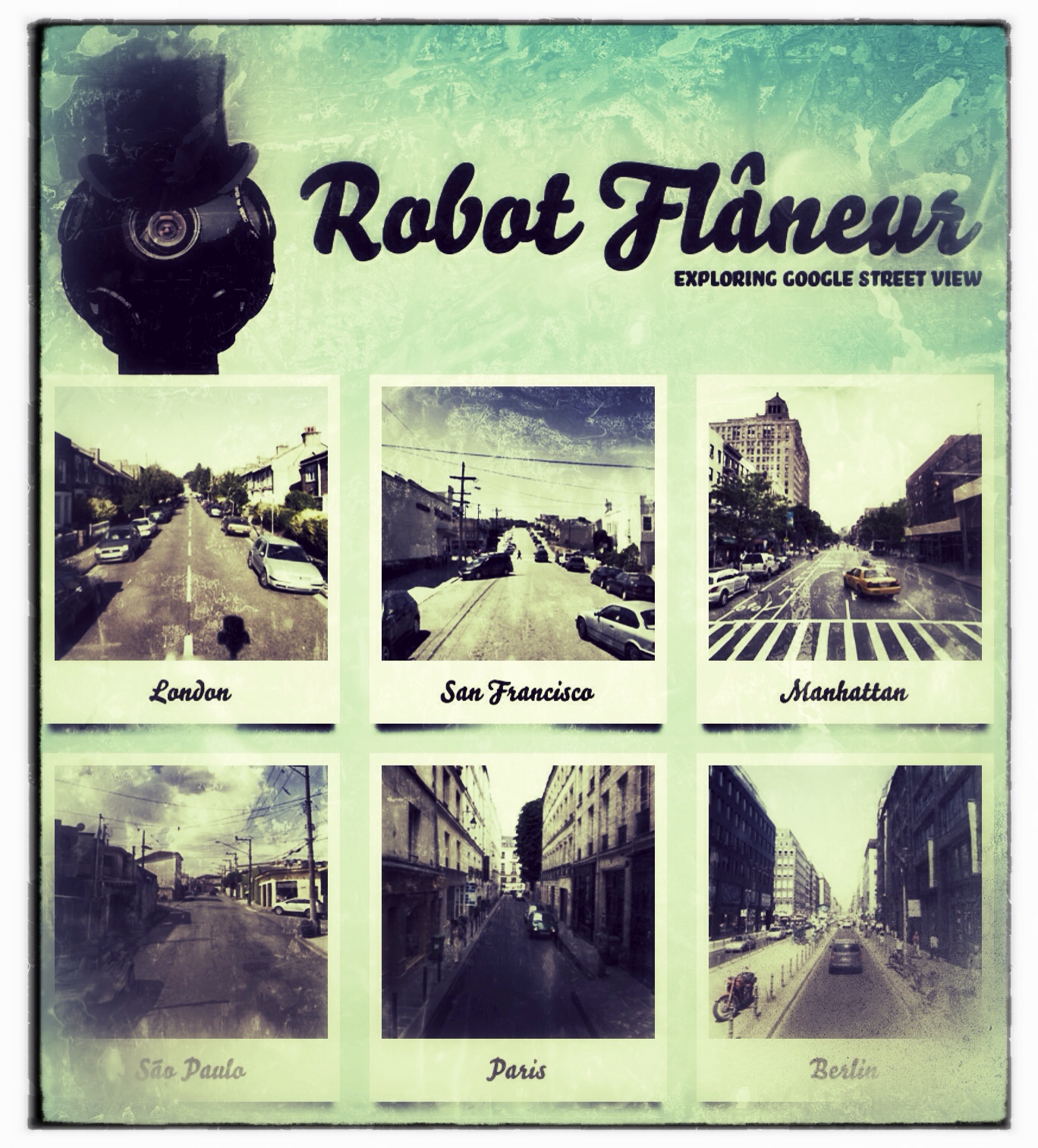
Robot Flâneur, a Google Street View "explorer".

Sometimes, while I’m supposed to be massaging meter or decluttering stories, I plug in the Robot Flâneur and savor the guilty pleasure of Parisian flânerie. Or Mexico City. Or Tokyo… Robot Flâneur is a visual “explorer” based upon the magic of Google Street View. Just pick one o the nine cities around the world and enjoy the voyeurism. But not for long! Remember, there’s all that work to do…

This digital indulgence, courtesy of London-bassed writer and technologist James Bridle (booktwo.org), is simple but intriguing. And not a little habit forming.

“Google Street View is both the view from the machine (from the car, the Ballardian view-of-our-times) and the view of the machine (the way the machine sees). Overlayed with data augmentation, from a non-human-natural perspective (the roof of the car), slightly lensed (fish-eyed), wholly networked.” ~ James Bridle

I can hear your voice vibrating through the internets: “Wonky!” And you’re right. Sort of. But Bridle may not be the best one to articulate the sizzle in his “web flâneur” steak. It’s siren call is really enticing, especially because it’s only an effortless mouse click away most of the time. But don’t take my word for it.

Utterly useless but strangely compelling site… The idea is simple. You find yourself in a random London location in Google’s Street View. Thirty seconds later you’re teleported to another random location. That’s it… [And yet] Robot Flâneur is oddly addictive. ~ Matt Brown (Londonist)

Take a scenic vacation sans pants… Each slideshow’s interactive shots have been hand-picked to most accurately represent the local urban culture, and’re navigable using keyboard shortcuts, which’ll inevitably end up getting you lost in an area where you’ll have to roll up your computer’s windows and lock the doors. (Thrillist)

Robot Flaneur… allows users the experience of a casual stroll around famed cities… Though simplistic, its voyeuristic capabilities prove addictive… For those of you with shorter attention spans, new images are refreshed every 30 seconds, with the option to zoom in, zoom out, or skip around. Just consider this the ultimate staycation. ~ Laura Feinstein (PSFK)

What are you waiting for? Give it a try! (But remember to drop a crumb trail…)

3D Art on Sidewalks

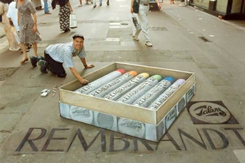
3D Art on Sidewalks (Photo: RedRoseRattus)

3D Art on Sidewalks (Photo: RedRoseRattus)

Have you witnessed 3D art on sidewalks? Chalk murals that create optical illusions so compelling they stop traffic?

I’ve mused about 3D sidewalk artwork before, wondering not only if it can blow minds but possibly also slow speeding vehicles. But I haven’t pondered its potential as a vehicle for storytelling. And yet it obviously is!

Telling a Story via 3D Art on Sidewalks

Literature and film have explored the idea of stepping into drawings for ages, using artwork as a gateway between reality and illusion. And yet 3D sidewalk and street artists are often dismissed with an amused shrug.

“Cool.”

“Weird.”

“It’s not graffiti exactly, but who’s going to clean it up?”

Julian Beever Creates 3D Art on Sidewalks (Photo: HMHung)

Julian Beever Creates 3D Art on Sidewalks (Photo: HMHung)


Is 3D Art on Sidewalks Just Chalk Graffiti?

3D art on sidewalks is cool and weird and graffiti, but cleaning it up is rarely a problem. In fact, it tends to vanish altogether too quickly. Rain. Pedestrians. Vehicle traffic. Perhaps its ephemeral nature is part of what makes 3D art on sidewalks and roadways so appealing. An invitation into another reality that will expire almost before you’ve decided whether or not to dive in.

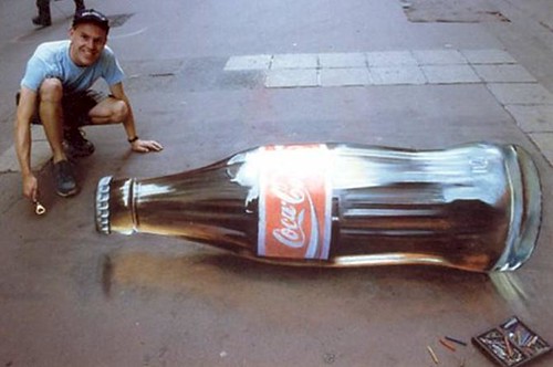
Street artists like Julian Beever, Edgar Mueller, Eduardo Rolero, Manfred Stader and Kurt Wenner distort perspective with little more than chalk, unfettered imaginations and a near perfect ability to render anamorphic illusions. When their artwork is viewed from the correct angle, an ordinary street or sidewalk creates the illusion of three dimensions.

Example Of 3D Sidewalk Art: A "Coca-Cola ...

Coca-Cola Bottle (Photo: RedRoseRattus)

Their chalk art transcends mere graffiti and many other art forms in its capacity for interactive storytelling. 3D art on sidewalks introduces a narrative possibility that engages viewers. Pedestrians and drivers stop and look. Perhaps they reorient themselves to better appreciate the optical illusion. They pause and let their eyes wander over the mural, actively suspending disbelief in order to engage with the image. In many cases the audience/viewer even choose to step into the image, playing along with the illusion, often posing for friends with cameras to memorialize the encounter.

A bit like a real life video game…

Victor Kossakovsky’s Lullaby

Dare to start your day with a lullaby? Good luck!

Victor Kossakovsky’s poignant three minute documentary about homelessness strips away all but the most most critical narrative elements: several simple shots of vagrants sleeping in a bank’s ATM foyer, three brief scenarios with ATM clients, ambient urban street noise, and an evocative “lullaby” which simultaneously soothes and mocks. The result is subtle, disturbing and captivating. I’ve already watched Lullaby twice this morning. I’ll watch it again.

Victor Kossakovsky

Victor Kossakovsky (Photo: Bert Kommerij)

The film poem’s location (Berlin) and music (sung by Nadezhda Utkina, an ethnic Udmurt) are foreign, but the theme is universal. Unlike the preachy, precious and shock mongering poverty diatribes with which we’re familiar,  Kossakovsky’s Lullaby offers a more complex snapshot of the problem.

I biked around my neighborhood and started filming. In one of my favorite moments, a woman opened a door leading to the A.T.M.’s and, when she realized that there were people sleeping inside, slowly closed the door and tiptoed away, saying, “Sleep well!” ~ Victor Kossakovsky (NYTimes.com)

Seen through the eye of the camera we don’t initially know why the woman stalls. I imagined her deliberating, calculating the risks of entering. Is she in danger? Will she be mugged? And then she turns slowly, quietly and leaves without using the ATM out of deference to the sleeping homeless people.

Victor Kossakovsky’s nuanced approach, enhanced by coupling a gritty urban scenario with a tender and innocent lullaby, leaves the viewer with more questions than answers. No tidy takeaway here. The mark of a gifted storyteller.

Victor Kossakovsky Update:

Returning to the NYTimes.com post I was surprised to discover no comments about Lullaby. I’ve primed the pump with the hope that it will prompt deserved praise for Victor Kossakovsky and perhaps prompt some debate among viewers less smitten. My comments won’t appear until moderated, so here’s what I wrote:

Subtle, poignant and haunting. I’ve watched the video twice driven by the same instinct that often compels me to read a poem twice, to perpetuate the experience and to swim deeper into its message. Victor Kossakovsky’s “Lullaby” offers a fresh (and overdue) look at the complexity of homelessness without preaching or reducing his message to a precious Helvetica slogan. Bravo!

Perhaps you’d like to share your reaction with Kossakovsky too? Let’s jumpstart the discourse!