iPhone 5S: Doodling Skeuomorphism
Don’t fret, friends, this isn’t an iPhone 5S perks and burps post. We’ll leave those to the gadget gurus. I’m actually pretty content with my iPhone 4S, but my 2 year contract is up (Or nearly up? Better check that!) and there are a couple of intriguing new iPhone 5S gizmos to tempt:
- iPhone 5S has a better camera (real value to me)
- iPhone 5S has a fingerprint sensor (hmmm… dubious/potential value)
But the most exciting iPhone-y newness getting hashed and rehashed in the scuttlebutt-o-sphere isn’t the iPhone 5S at all. It’s iOS 7. And the prospect of both wrapped up tidily together? Hmmm…
This software looks nothing like the old iOS. It’s all white and clean, almost barren… Above all, it completely abandons Apple’s formerly favorite design principle, skeuomorphism, in which on-screen things depict real-world materials… iOS 7 is more efficient to navigate, because nothing on the screen is eye candy; everything is a button, so you spend less time hunting for things.
Furthermore… Siri… responds faster, has a more realistic voice and understands new kinds of commands (NYTimes.com
If only Siri could massage my shoulders. Of course my bride already resents Siri’s intrusions into our otherwise monogamous marriage, so massage could prove dangerous. I retract my wish and unrub the genie. Safe?
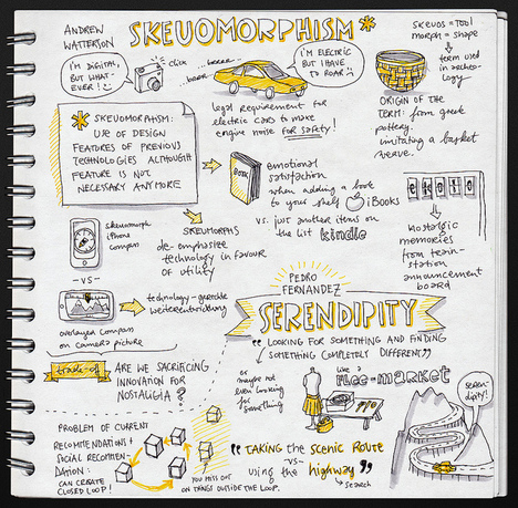
Honestly, the real inspiration for this post is the totally un-tech-geeky iPhone 5S doodle above. Genius! And learning about skeuomorphism is the icing on the cake. Perhaps you need a little help with skeuomorphism? I did. Try this super helpful skeuomorphism sketchnote by Eva-Lotta Lamm.

Skeuomorphism Sketchnote (Credit: Eva-Lotta Lamm, Core77)


