Doodles and SuperDoodles
A while back I stumbled upon (tweetled?) The Doodle Daily, a clever creative crash course in the art of doodling.
Actually, Warren, the blog’s creator wouldn’t call it that. He’s a fair share less pretentious than that. He originally set out to create and share a doodle each day for a year. He succeeded. And he got stuck succeeding, so we all can benefit from his so-far-bottomless fount of doodles.
I’d actually almost forgotten about Warren and his addictive designs until yesterday. He materialized out of the ether. Poof!
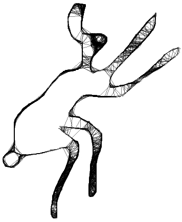
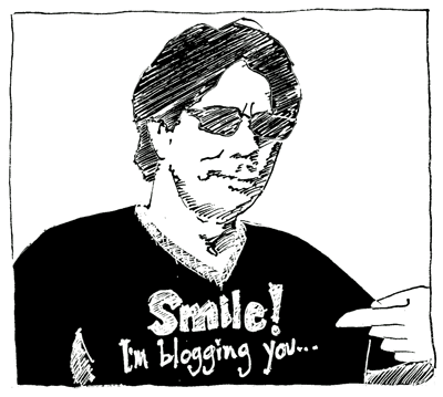
Okay, so it wasn’t really a poof. But he did post a comment that sent me somersaulting back to his doodle blog to catch up on his creative enterprise. And much catching ensued including the dazzling image above.
Deft doodle design! I like it a lot, but why? It’s just another dandy doodle, dude.
Or is it?
There are doodles and there are doodles. There are dumb-ditty-doodles and there are whipper-doodles. (Also Labradoodles, but they’re really far off topic, and I’m hoping to limit my present acrobatics to merely-slightly-off-topic…)
So what makes a whipper-doodle special? What defines a super whipper-doodle? Warren sums up his SuperDoodle thus:
Simple, clean
classic
He’s on to something. Of course whipper-doodle rules are far from universal, but it does seem that at least a few essential ingredients can be found. Perhaps simple, clean and classic should be on the list. Classic might be too limiting, though I understand what Warren’s going after here. It’s a familiar design despite being original. Or it seems familiar. It exudes familiar canonical design roots, perhaps…
I’d suggest that there’s more to it though. In this doodle, for example, there’s symmetry or near symmetry. Warren’s SuperDoodle combines two separate, reverse mirror images. The symmetry is instantly appealing, especially so because the design is a bit complex, a bit ornate. And yet Warren’s inky oracle plays with the symmetry, plays with the viewer really, by distorting the scale of the nearly symmetrical half. Perhaps the composite consists of two conceptually symmetrical halves that deviate in execution. Now I’m approaching the sort of gassy verbiage upon which dissertations are built!
Suffice to say that a whipper-doodle is more evolved than a dumb-ditty-doodle. It contains a sort of universal design appeal. I think of the glorious paisley in its infinite iterations, or the minimalist lines of prehistoric hieroglyphs or globally familiar brands such as the Red Cross, the Jewish star, the Nike swoosh. (If tucking these dissimilar entities into a single rucksack and calling them “brands” offends, please excuse. This is not my intention. Simply overlook that last sentence and leap-frog to the next paragraph!)
After the first flush of my aesthetic crush fades, I catch myself asking what compels me, what draws me into Warren’s doodle? It’s clean and elegant, but it’s also playful. The near symmetry flirts with me, cocks her ringleted visage coquettishly and bats her eyes, smiles just enough to draw me in. I study the image, my eyes volleying back and forth, back and forth verifying accuracy, chuckling at the elements shrunk and stretched just enough to intrigue… I am drawn in. And I am smiling. Thank you, Warren.
Related articles
- Tile? Mandala? It’s The Doodle Daily! (vitualdavis.com
- Does Your Doodle Have Meaning? (wycd.radio.com)
- Doodle Sandals? Oh yeah!!! (kinkychinkecreations.com)
- Very cool “Google” doodles !! (einshtein.wordpress.com)
- Doodle an Animal (deltiolog.wordpress.com)


