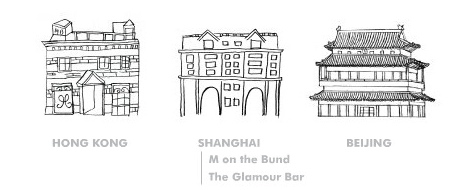
 Despite my withering review of M on the Bund in Shanghai, I remain intrigued by some of the design elements of their website… Although the actual restaurant-specific drill downs are not particularly innovative, the general home page experience is similar to the concept I’ve been working on for Rosslyn Redux.


